Moneyshot is an iOS app that provides users with a snapshot of their personal finances.
![]()
![]()
![]()
![]()
![]()
![]()
![]()
![]()
Goals
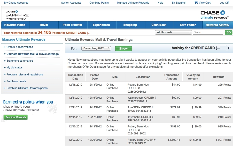
Credit cards, in their current form, are designed to help people overspend. One reason is the high latency between buying something, and realizing how quickly your spending bill is adding up. The overspending problem is further underscored by the design of credit card portals, fraught with lengthy login processes and pieces of account information and numbers that often confuse, rather than inform, the user.
Goals
I aimed to create an intentional spending environment that helped users become aware of their purchases and make feedback loops to re-adjust course as necessary.
The goal for this project is that: time spent learning about finances > time spent navigating through finances.
In poorly designed interfaces, a user spends most of her time navigating, not learning. Good design can address the navigation issue with the right features.
Evaluate features against goals
Prototype 1
First, I started by exploring ways to make learning about personal finances fun. I wanted to create an experience for interacting with individual transactions that was both pleasurable and reflective.
My first prototype involved an experiment with swipeable cards that allows a user to evaluate each of her transactions and sort each according to whether she is satisfied with her purchase, or regrets buying the item.
After the user swipes through all their transactions in the past week, the application generates a list of transactions she feels dissatisfied with, and the amount she would have saved had not purchased them.
I sought to integrate a form of loss aversion -- our tendency to be motivated by what we have to lose rather than we have to gain -- into this experience design. The List of Avoidable Transactions attempts to motivate users with the potential savings they have lost, urging them to be more aware of what they could lose the following week.
While gamification and adding a points system feature seems natural to this type of design, endemic to any game we play is the sense of winning or losing, which comes guilt. The purpose of the cards is not to make users feel guilty, but to help them become more aware of how they are spending their money. This awareness is ordinarily lost in credit card portals.
Prototype 2
Swipeable cards addresses the learning problem, but not the problem of navigating through finances. Currently, in order to track personal spending, a user spends a bulk of her time navigating through different banking and credit card portals.
When there are many ways to navigate, a user can get stuck in many different states and grow confused. The dozens of states in current banking and credit terminals (from the multi-stage log-in process to the wide and varied credit card company platforms) suggests that these platforms are cumbersome to check, leaving people in the dark about the state of their personal finances.
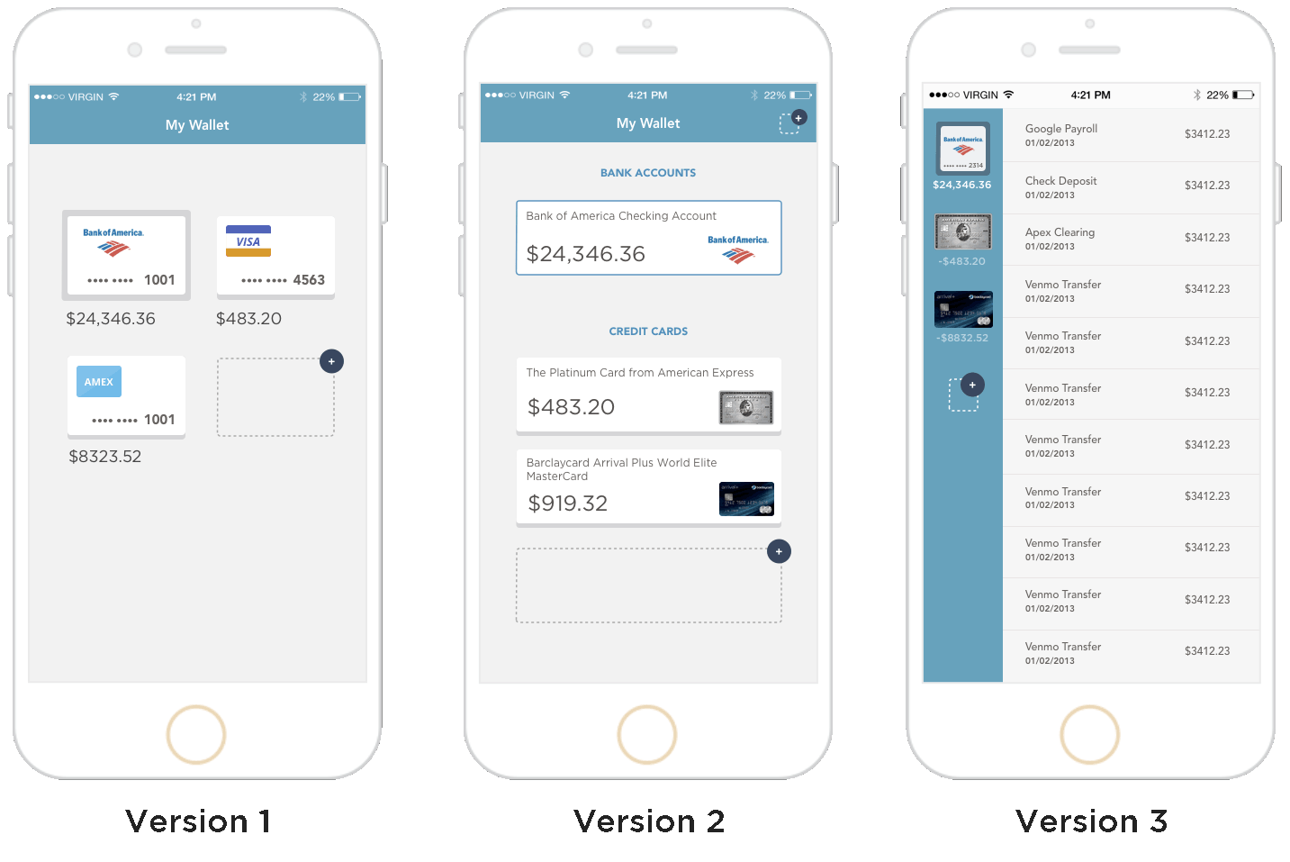
Subsequently, I designed several prototypes that attempts to address the navigation issue by aggregating spending and savings information. Each offers various trade-offs.
While the prototypes appear straightforward, they still do not fully address the navigation problem, as the flow could be made even simpler with a single screen.
Prototype 3
My early prototypes and user research underscored two themes.
Theme 1: Good interaction reflects how humans, not computers, deal with information. When tabs are used correctly, they improve usability. This is because tabs act as metaphors that, when used well, facilitate familiarity between the user and the application by mirroring real-world tab dividers.
Ideally, tabs divide content into meaningful sections. The method of organization motivated my first prototypes:
This organization extended to the subsequent prototypes in a form different from tabs from above.
While we may conceptualize our physical wallets with credit cards, and our finances by the online portals of different credit cards, we do so largely not by choice — but because this is how our computers deal with information.
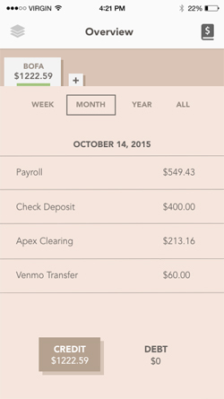
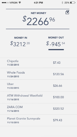
While a user may plausibly first turn to her credit card balances when she thinks of her personal finances, she would more likely turn to combined numbers: “How much money have I spent? How much money have I earned?”
This framework motivated a revision of the screen.
Theme 2: Let the user correct the information, not construct it. A user who constructs information for the app will have more uncertainty while navigating through screens of the interface. While I considered the mobile device’s screen size and prototyped this sign up flow:
I ultimately decided that the full screen nature failed to give the user purpose in a way achieved by an inline style.
The inline placement of balances allows the user to correct the interface by updating the initial $0 balance, providing purpose for providing bank information in the first place.
Final Designs
1. First-time Introduction
2. Home Screen
3. Link a New Credit Card
4. Updated Home Screen
Looking forward: An ambient overlay
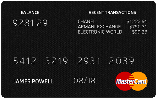
The ideal would be for this information about spending to be tightly linked with the form factor used for spending. Consider an alternative way for a user to check her balance, where information on total spending and purchases overlays onto her credit card.